Oh My Bean

Client:
Brand strategy:
Lenka Sršňová, Michal Kříž
Photography:
Work:
visual identity, packaging design, logo design
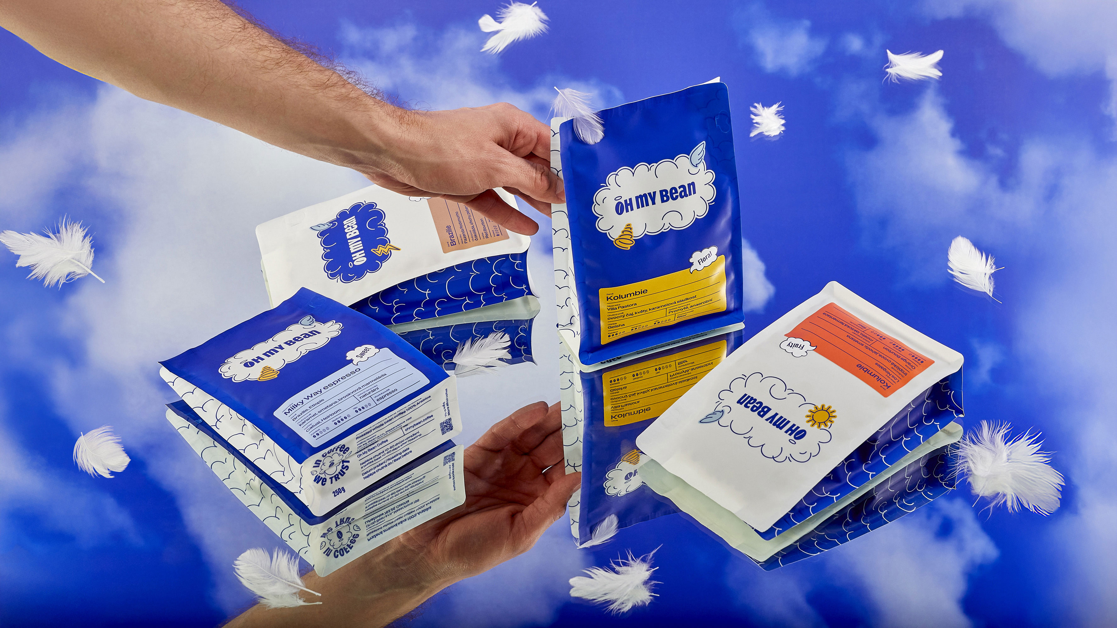
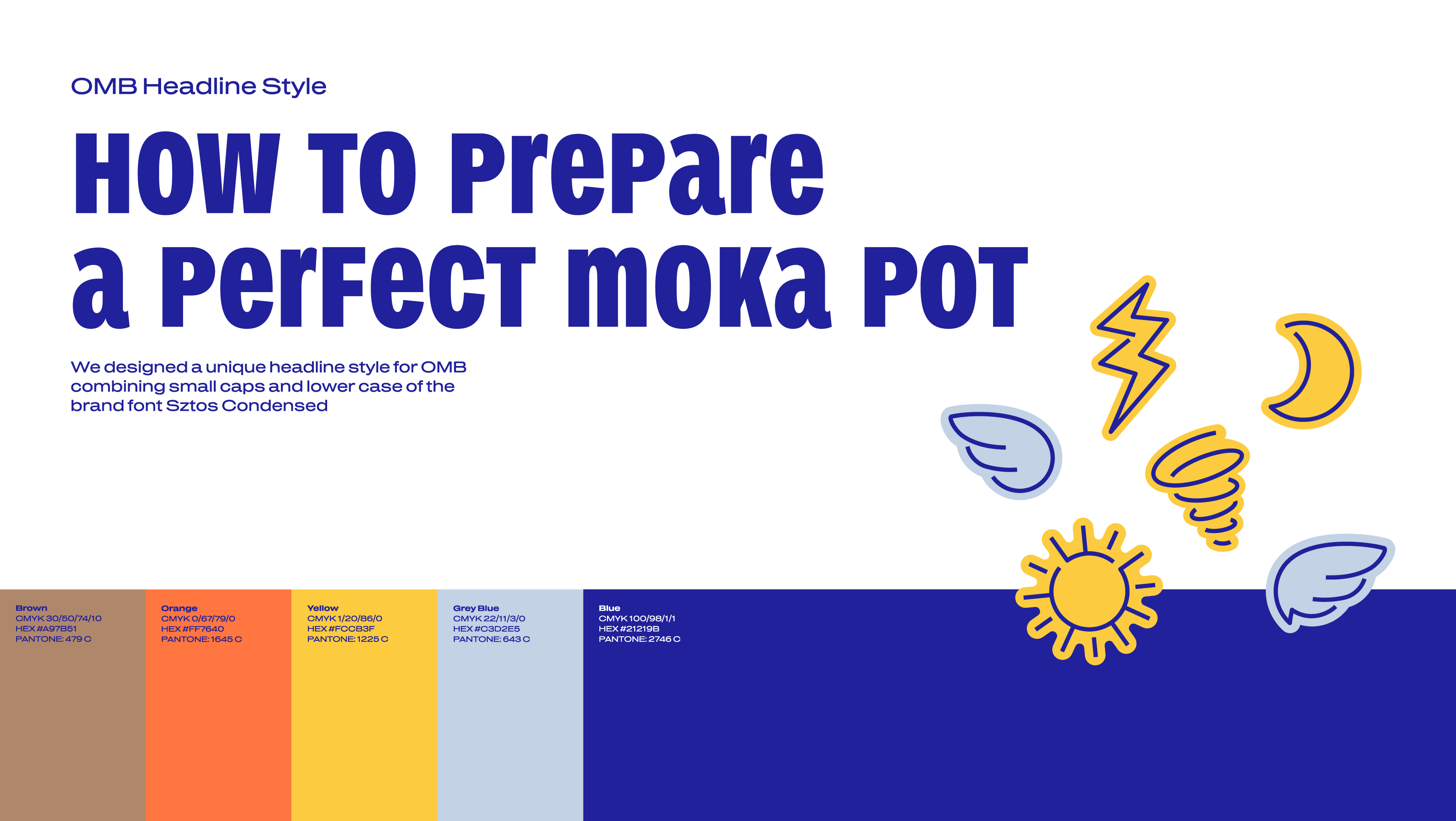
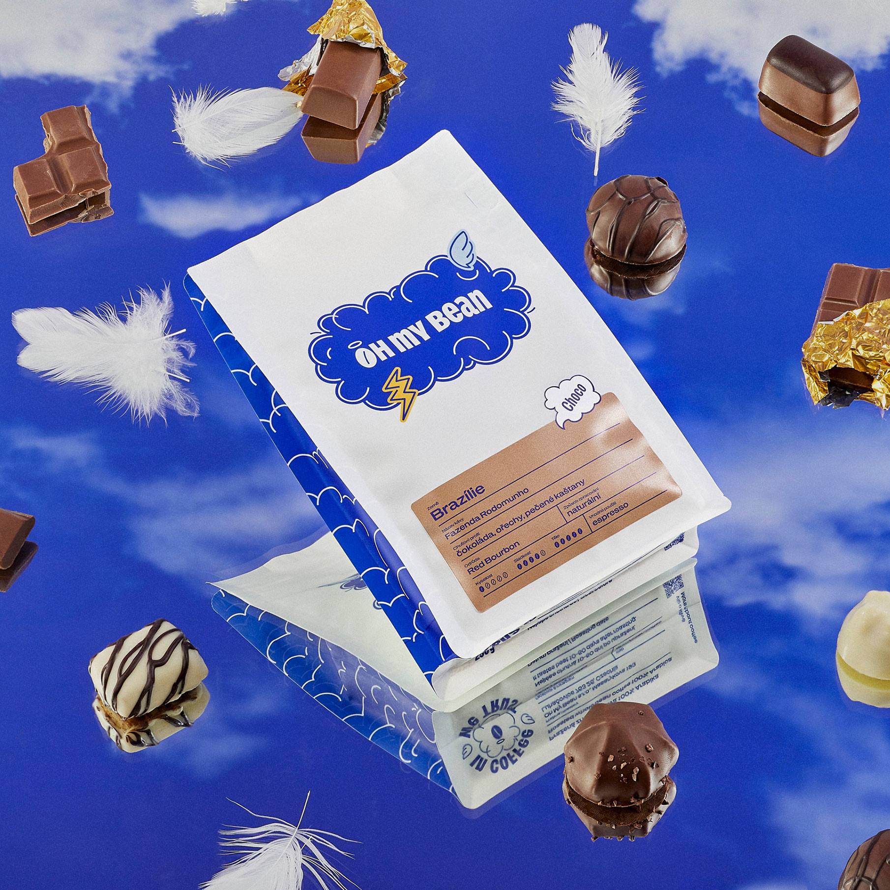
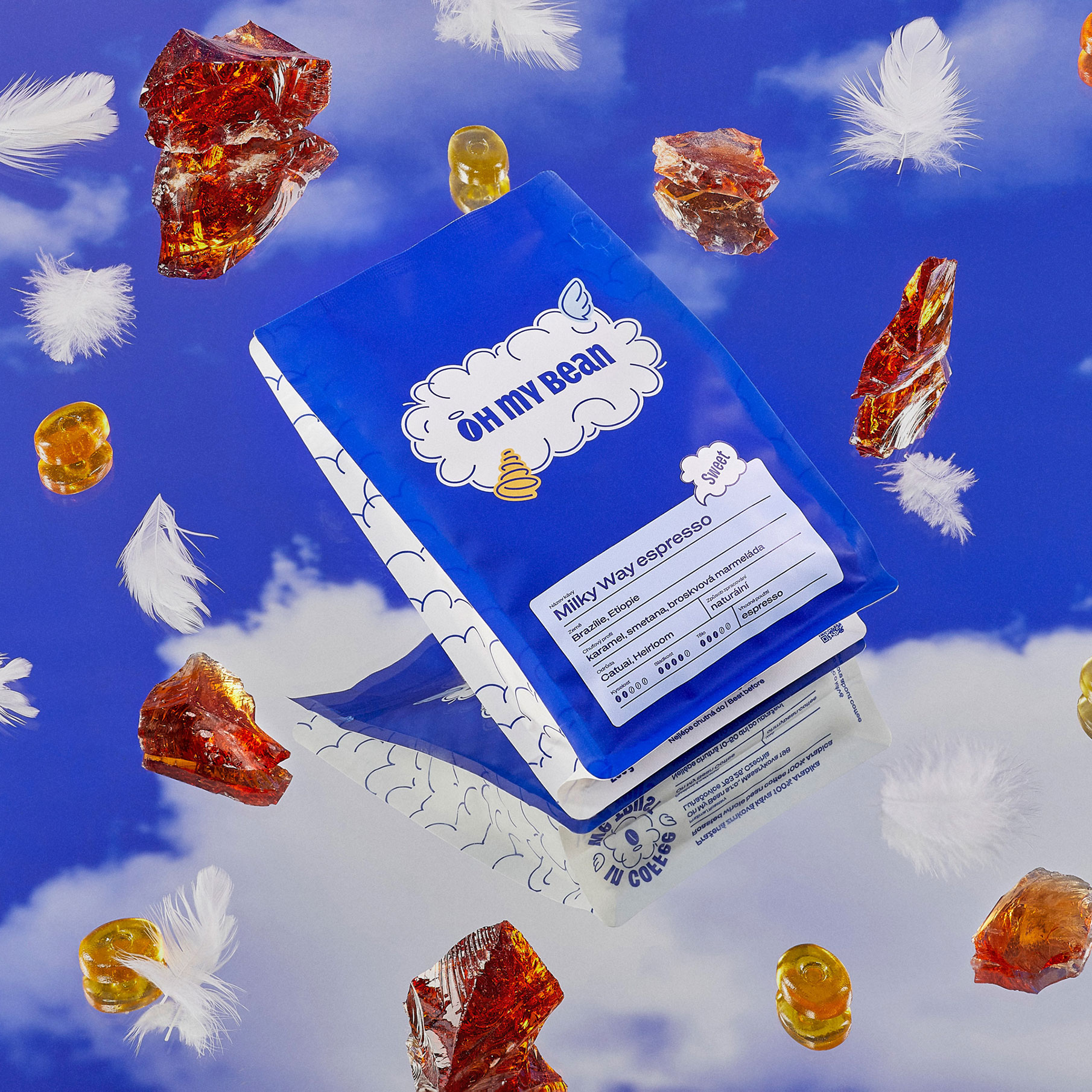
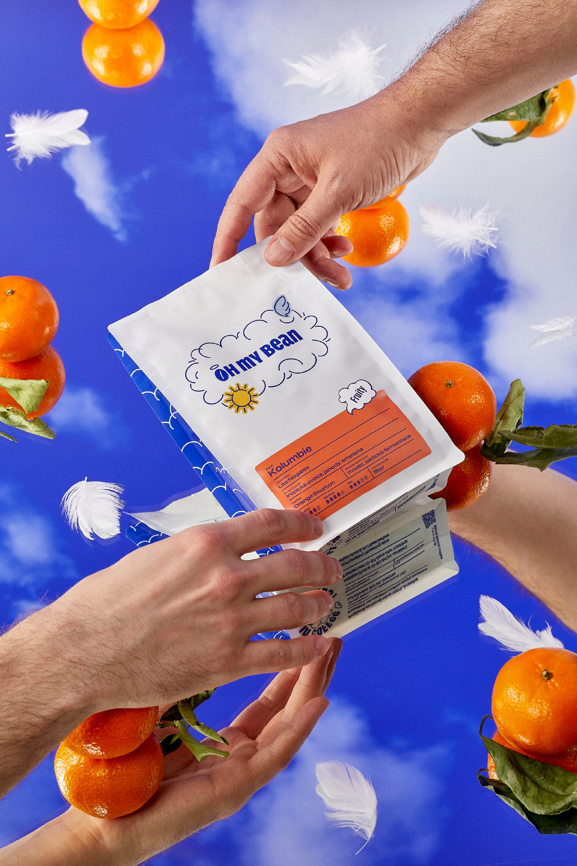
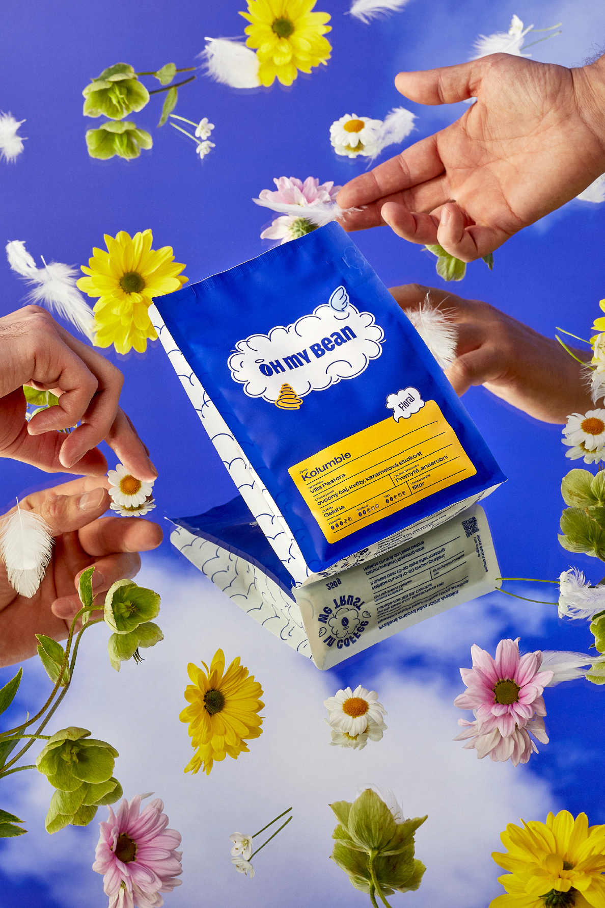
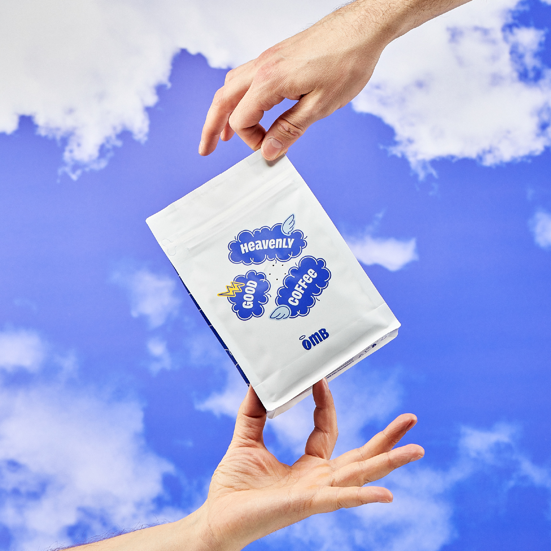
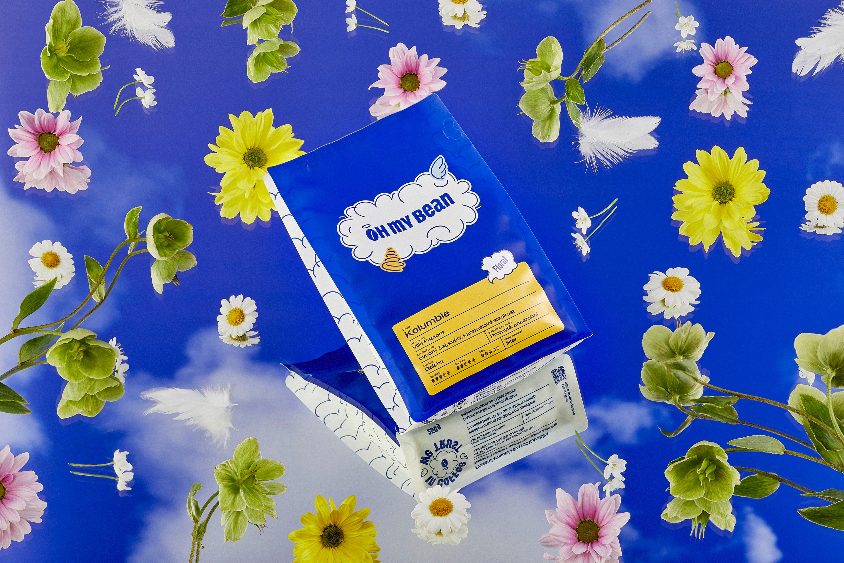
After a bold shift in name and strategy, this roastery needed a visual identity to match their new direction – something playful, memorable, and full of personality. That’s where we came in.
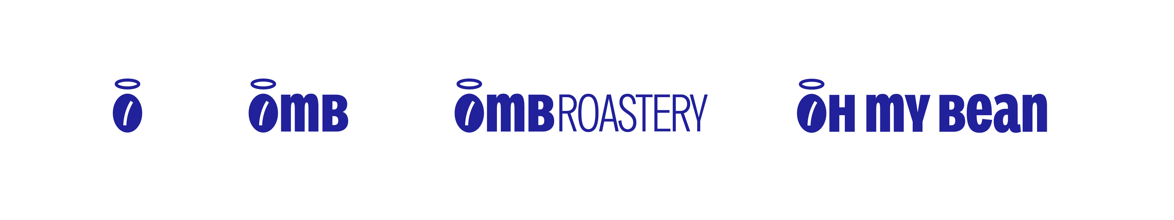
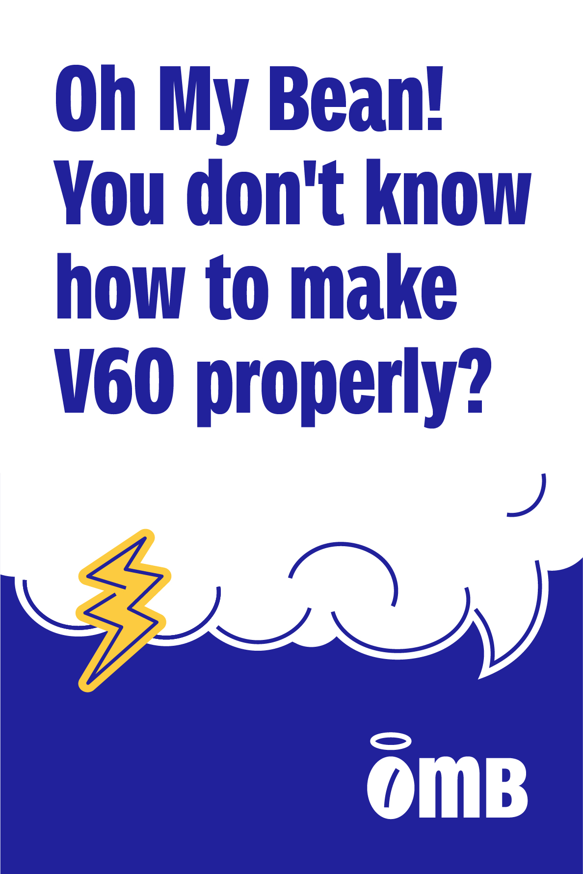
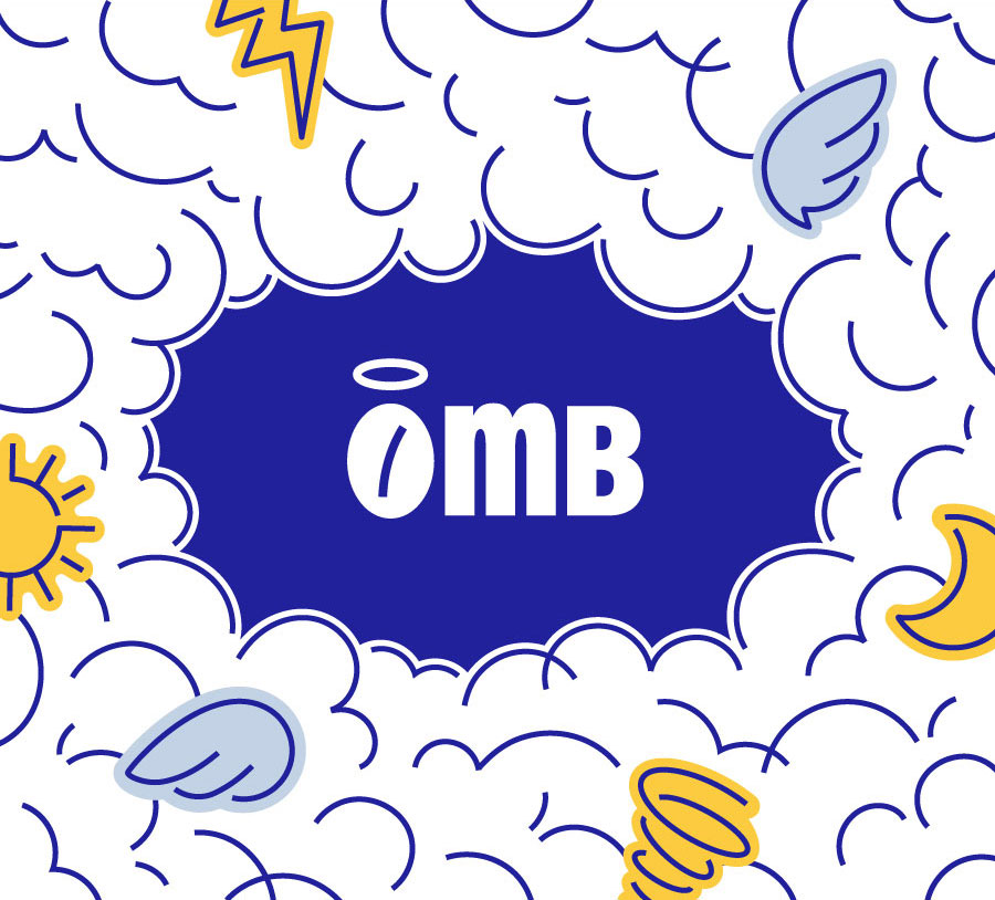
With a name like Oh My Bean, we couldn’t help but lean into the divine. The holy bean – a single, haloed coffee bean – became the heart of the brand. From there, everything flowed: cloud-like shapes, tasty typography, and packaging that feels as uplifting as a great cup of coffee. Because honestly, if heaven exists, we’re pretty sure it smells like freshly brewed beans.